ABOUT
Mend is a trauma-informed journaling app designed to help accident survivors document their recovery journey.
CHALLENGE
Accident survivors often lack a simple way to track their recovery, leading to poor care continuity, emotional overwhelm, and slow insurance processes.
MY ROLE
Product Designer
Design Strategy
Design Excecution
TIMELINE
Jan 2024 - Jan 2025
50%
Increase in Journaling Consistency among Accident Survivors
15%
Improved Patient-Clinician Communication
28%
Reduced Insurance Processing Time
The Plot
Lucie came to me with a bold vision, to create a journaling app that empowers accident survivors document their recovery and share it with doctors, lawyers, insurers, or whoever needed to be brought into their journey.
But there was one catch: almost no budget and even fewer resources.
At first, I hesitated because how do you build something so complex, so emotionally delicate, with so little? It felt impossible. But I couldn’t let it go.
Accessing UX before the design
After much deliberation, I decided to work with what she had.
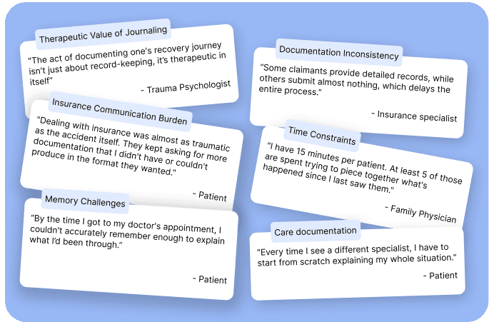
I gathered insights after interviewing 10 clients and stakeholders from the company...
…then, I identified four main goals that would guide the design and impact of the app.
Make recovery easy to document
Simplify communication across care teams
Foster a sense of agency in recovery
Improve memory recall for medical appointments
Exploring and Designing

A very rough representation of the app's content
Concept 1
Concept 2
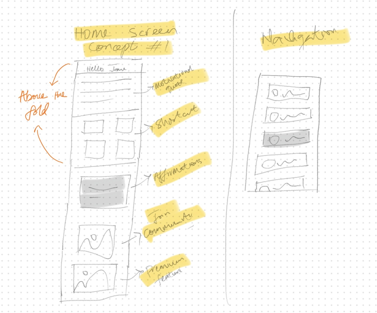
Layout
Progressive layout
Logic
This concept is emotional and contains more information with additional navigation.
Concept decision
I settled on concept 2 based on strong user preference expressed during interviews.
Design Flow
There was no time to create low-fidelity mockups, so after assigning roles to other designers, we went straight to designing and prototyping.
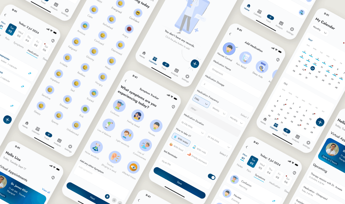
Unifying Design Library
Icons
Illustrations

Emojis

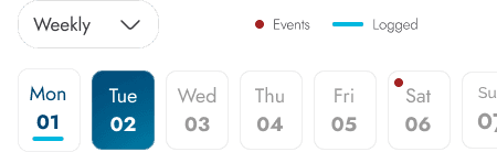
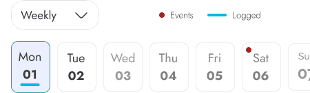
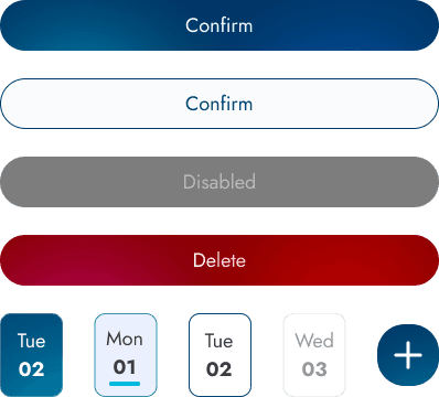
Calendar navigation
Menu Navigation
Notes
Pain
Symptoms
Medication
Sleep
Mood
Lifestyle
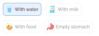
Forms

Selection
Navigation selection

Buttons
Appointment forms

Usability Testing Results
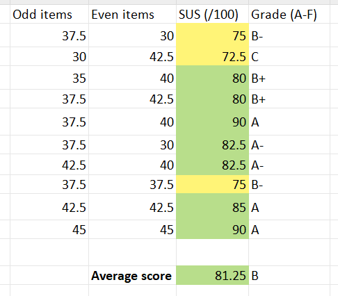
Result of SUS conducted after final designs
Lesson Learnt
This was the most chaotic project I had ever worked on, and here are some things I learnt
The limited budget and time pushed me to make focused decisions and to prioritise what mattered most to users.
Not everything will go as planned, and flexibility became my superpower!
Documentation is be a lifesaver. We had new developers joining the team almost every month, and without a project manager, I had to onboard them while juggling multiple roles.
Despite the tight budget, strong collaboration across teams was possible thanks to clear and consistent communication.
