
Designing point-of-sale experience for The Jacobs' waiters
Designing point-of-sale experience for The Jacobs' waiters
Designing point-of-sale experience for The Jacobs' waiters
About
The Jacobs is a family restaurant that needed an efficient system to streamline operations and enhance the experience for both employees and customers.
The Jacobs is a family restaurant that needed an efficient system to streamline operations and enhance the experience for both employees and customers.
Challenge
The on-premise approach led to an inconsistent user experience across various devices and systems, ultimately hindering the business's scalability and sustainability.
The on-premise approach led to an inconsistent user experience across various devices and systems, ultimately hindering the business's scalability and sustainability.
Impact
I created the design system, representing their brand to enhance efficiency and ensure seamless adoption.
I created the design system, representing their brand to enhance efficiency and ensure seamless adoption.
Team:


5+
My role
Design patterns analysis
Design patterns analysis
Adaptive design system
Adaptive design system
Key flows analysis
Key flows analysis
Key flows redesign
Key flows redesign
Timeline
August 2019 - February 2020
August 2019 - February 2020
Story Time
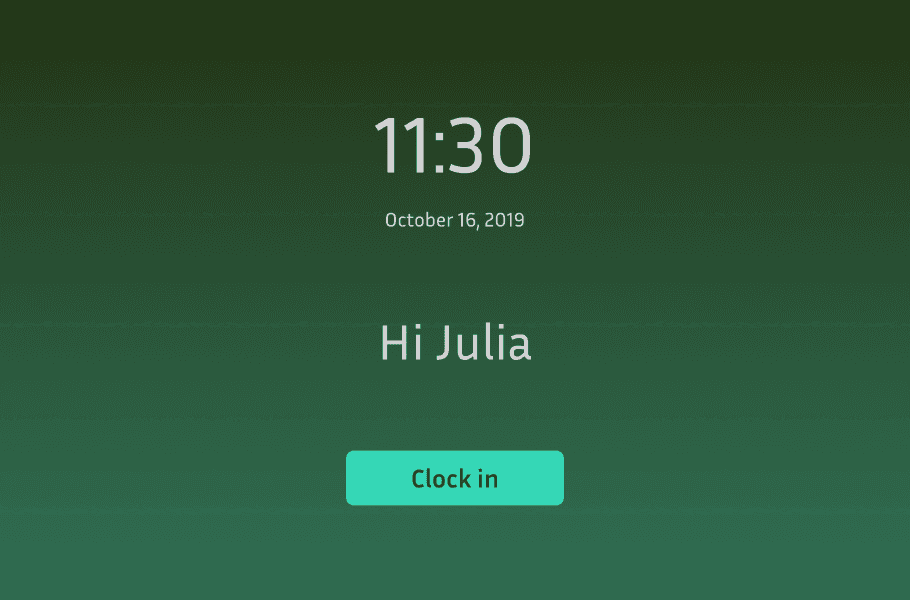
It’s my first day at The Jacobs restaurant, and the manager hands me a worn-out order notebook. Servers rush back and forth, shouting orders to the kitchen, while chefs scramble to keep up…
It’s my first day at The Jacobs restaurant, and the manager hands me a worn-out order notebook. Servers rush back and forth, shouting orders to the kitchen, while chefs scramble to keep up…
“This is how we’ve always done it,” he says. Watching the chaos unfold, I can’t help but think there has to be a better way. And that’s where my design journey begins.
“This is how we’ve always done it,” he says. Watching the chaos unfold, I can’t help but think there has to be a better way. And that’s where my design journey begins.
Early design exploration
After that, I got to meet with the team to share the UI direction for a leadership presentation coming up in the next two days...
After that, I got to meet with the team to share the UI direction for a leadership presentation coming up in the next two days...
And having worked for about 2 years with startups, I’ve learnt that a well-crafted mockup can say more than a slide deck ever could. So, I jump in, quickly designing a mockup to bring the vision to life for the presentation.
And having worked for about 2 years with startups, I’ve learnt that a well-crafted mockup can say more than a slide deck ever could. So, I jump in, quickly designing a mockup to bring the vision to life for the presentation.
We got the go-ahead!
The challenge is clear: how do we design a brand-new system from the ground up that seamlessly fits into the restaurant’s fast-paced workflow? To tackle this complexity, as a team, we broke it down into 3 stages.
The challenge is clear: how do we design a brand-new system from the ground up that seamlessly fits into the restaurant’s fast-paced workflow? To tackle this complexity, as a team, we broke it down into 3 stages.
Chapter 1
Ideation

Documented ideas in real time as they emerged during the research process.
Documented ideas in real time as they emerged during the research process.

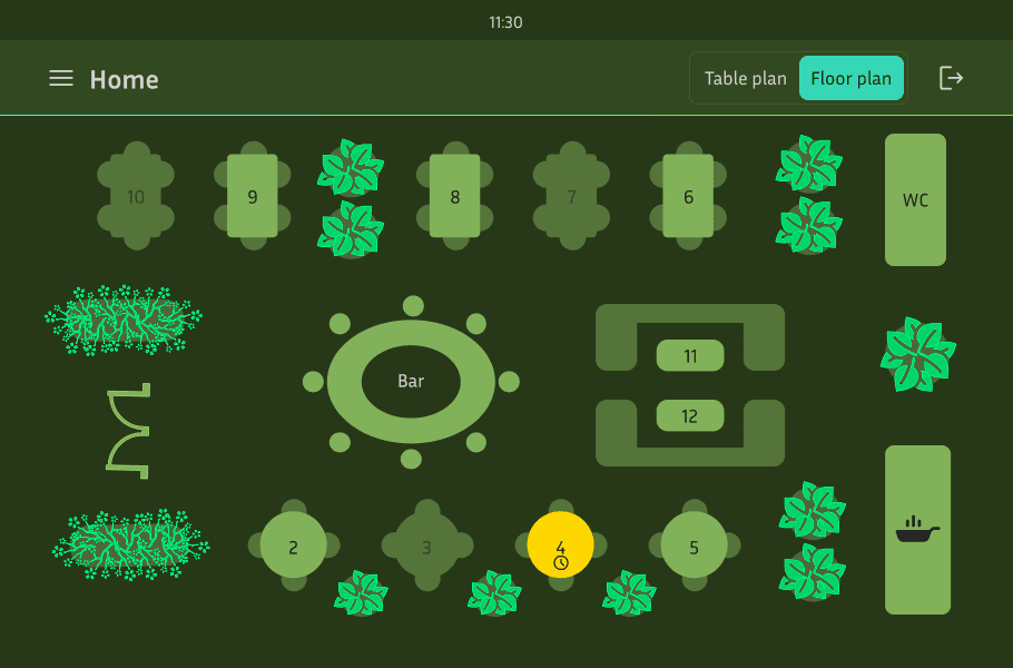
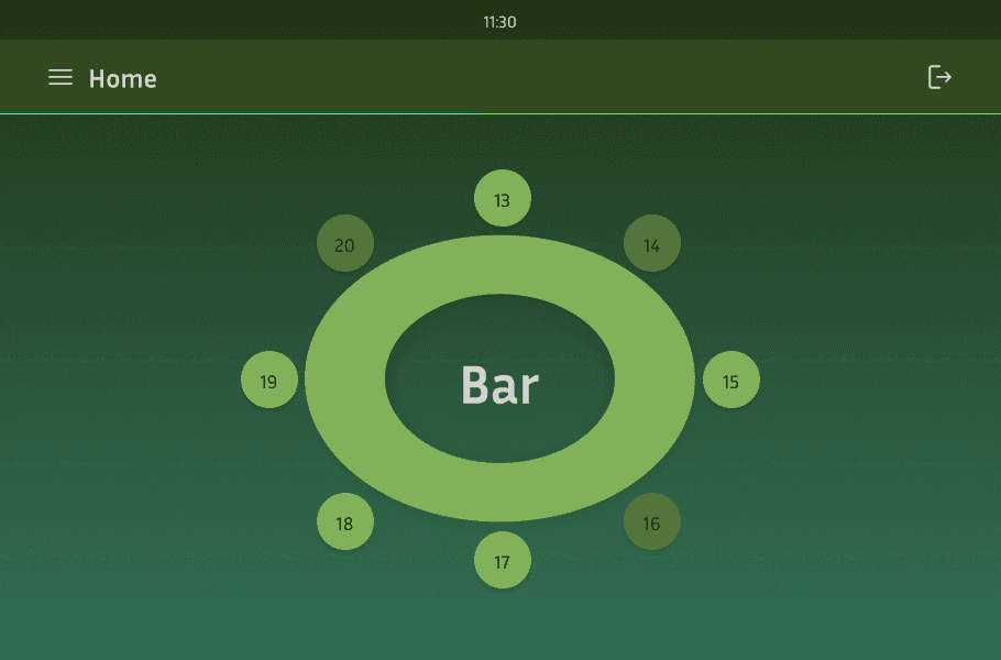
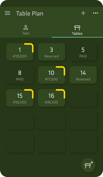
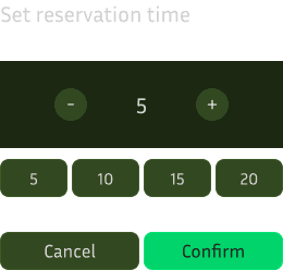
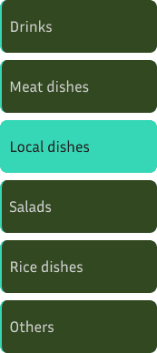
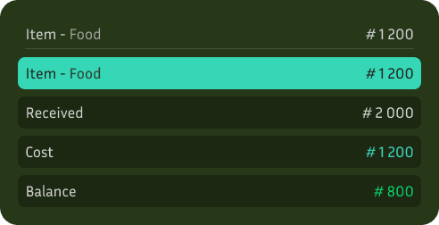
After exploring and researching various layout possibilities, we identified four key patterns that best suited the fast-paced workflow of restaurant staff
After exploring and researching various layout possibilities, we identified four key patterns that best suited the fast-paced workflow of restaurant staff
Chapter 2
Visual tone
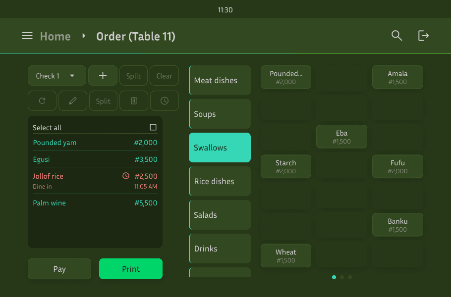
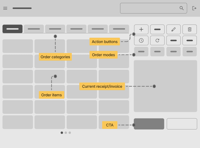
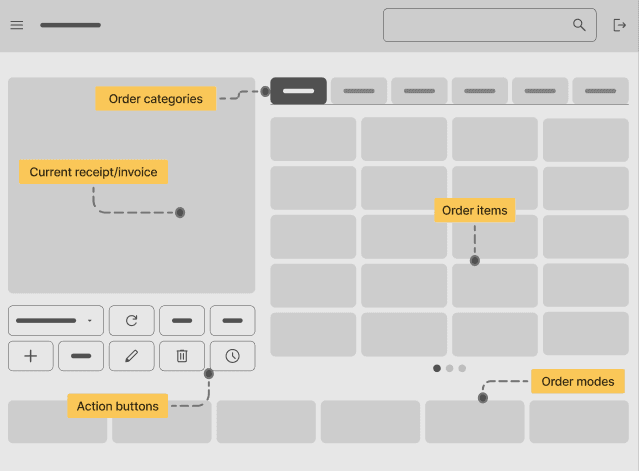
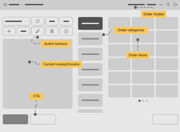
Rather than building every component from scratch, we leveraged Material Design guidelines and additional resources to develop a cohesive and efficient design system.
Rather than building every component from scratch, we leveraged Material Design guidelines and additional resources to develop a cohesive and efficient design system.
Dark mode
Light mode
Background
Secondary

#324820
Primary

#273818
Container

#1C2811
Typography
Enabled

Fill: #D2D2D2
Secondary

Fill: #A9A9A9
Pressed

Fill: #D2D2D2
Disabled

Fill: #646464
Awaiting

Fill: #FFD700
Warning

Fill: #FF8282
Highlighted

Fill: #00D46A
Borders
Primary
#1D2A12
Size: 1px
Secondary
#273819
Size: 1px
Selected
#00D46A
Size: 1px
Attention
#FFD700
Size: 1px
Error
#FF8282
Size: 1px
Shadows
Modal
16 pd
FAB
12 pd
Button
2 pd
To suit varying lighting conditions in the restaurant, we designed both Light and Dark modes with automatic switching based on ambient light.
Dark mode
Light mode
Background
Secondary
#324820
Primary
#273818
Container
#1C2811
Typography
Enabled
Fill: #D2D2D2
Secondary
Fill: #A9A9A9
Pressed
Fill: #D2D2D2
Disabled
Fill: #646464
Awaiting
Fill: #FFD700
Warning
Fill: #FF8282
Highlighted
Fill: #00D46A
Borders
Primary
#1D2A12
Size: 1px
Secondary
#273819
Size: 1px
Selected
#00D46A
Size: 1px
Attention
#FFD700
Size: 1px
Error
#FF8282
Size: 1px
Shadows
Modal
16 pd
FAB
12 pd
Button
2 pd
To suit varying lighting conditions in the restaurant, we designed both Light and Dark modes with automatic switching based on ambient light.
Default mode
Accessibility mode
95% of people
Will see this
Contrast ratio 7.19:1
✓AA
✓AAA
Attention
Contrast ratio 5.55:1
✓AA
✓AAA
Selected, pressed
Contrast ratio 4.21:1
✓AA
✓AAA
Error, problem
Contrast ratio 5.1:1
✓AA
✓AAA
Success, confirm
Deuteranomaly
6% of men, 0.4% of women
Attention
Selected, pressed
Error, problem
Success, confirm
Protanopia
1% of men
Attention
Selected, pressed
Error, problem
Success, confirm
Tritanomaly
0.01% of people
Attention
Selected, pressed
Error, problem
Success, confirm
We prioritised accessibility by ensuring colours for attention, especially green and red, are distinguishable for users with visual impairments.
Merging tokens and components


Chapter 3
Flow design
Rather than building every component from scratch, we leveraged Material Design guidelines and additional resources to develop a cohesive and efficient design system.
Rather than building every component from scratch, we leveraged Material Design guidelines and additional resources to develop a cohesive and efficient design system.
Key Takeaways
Designing the PoS experience wasn't smooth and under-resourced. However, it was exactly what I needed at the time, as this project pushed me out of the theoretical aspect of design.
Even though looking at this project now makes my skin crawl, I am proud to see my mistakes and what I can do differently if given the opportunity to redo it.
Consistent improvement and iteration beat perfectionism.

NEXT PROJECT
MEND
Mend is a trauma-informed journaling app designed to help
accident survivors document their recovery journey.
Mend is a trauma-informed journaling app designed to help
accident survivors document their recovery journey.
READ CASE STUDY
READ CASE STUDY
READ CASE STUDY
READ CASE STUDY